Sons & Daughter Brewing Co.
Brand Identity
Packaging Concept
Marketing
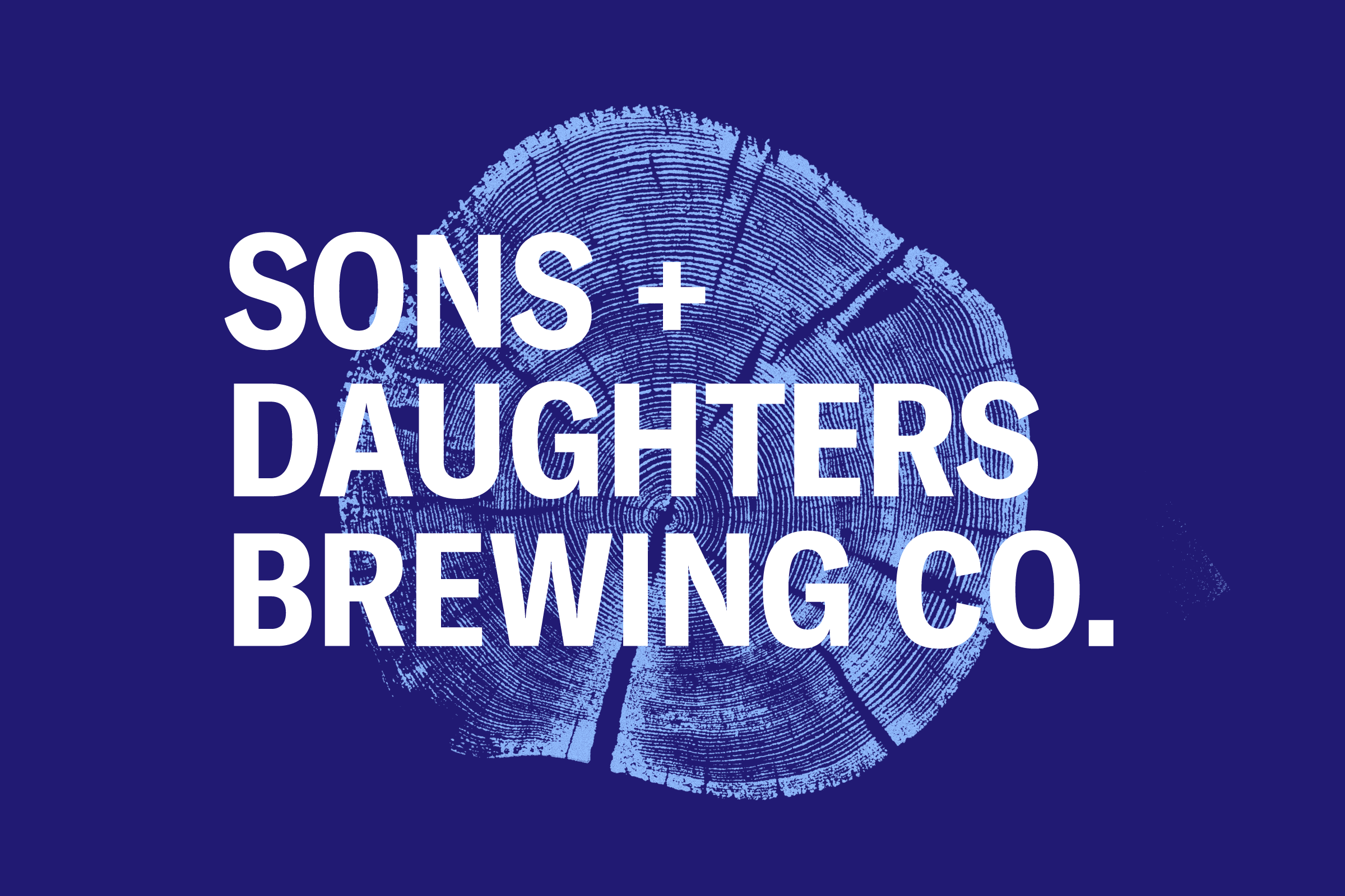
The Boston-based Sons + Daughters Brewing Company was seeking a strong original brand identity for their brewery and packaging design. The brewery's name is inspired by the American colonials who protested unjust British taxation and governance measures in Boston prior to the start of the American Revolution—the Sons and Daughters of Liberty. Taverns were a favorite meeting place of these earliest American revolutionaries because the bar owners were sympathetic to their cause.
The owners of the Sons + Daughters Brewing company are similarly passionate about inclusivity and freedom for all, and they wanted to build a strong brand identity around legacy, interconnections, and family while also conveying their commitment to integrity and quality.

Brand Concept
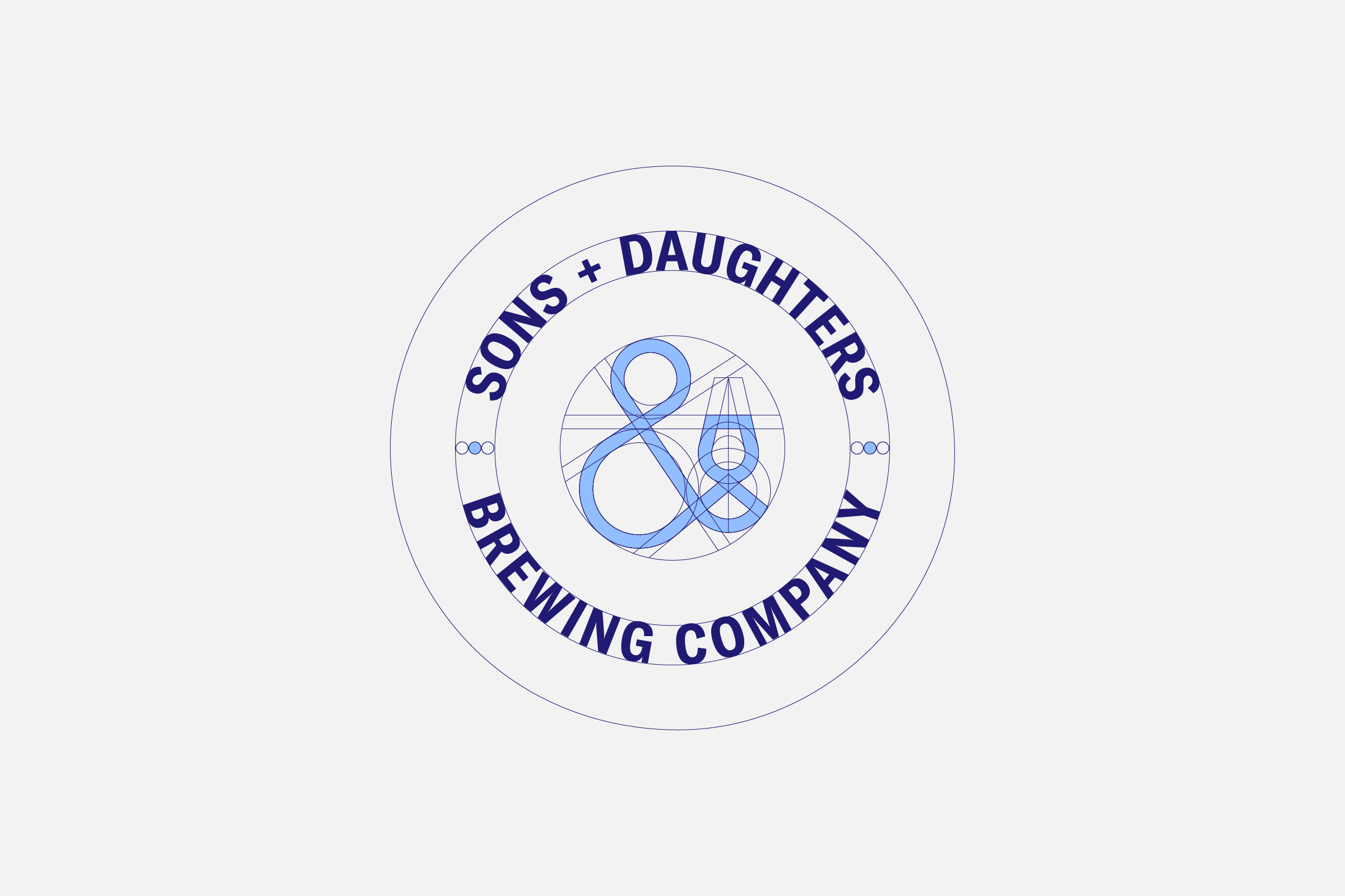
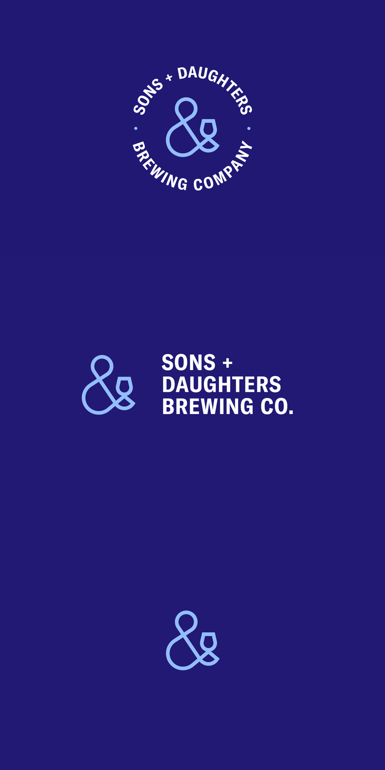
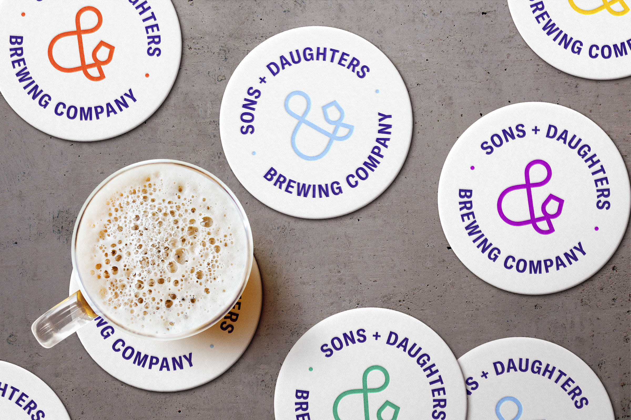
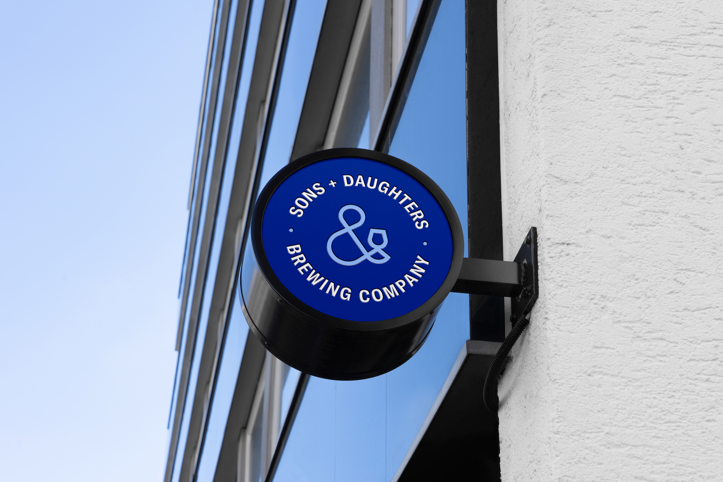
The brand logo is a traditional emblem, consisting of both symbol and font, with minimalist and contemporary sensibility. The continuous symbol resembles both an ampersand, an abbreviation for "and", and an abstract depiction of a bar patron with brew glass. Circling the symbol, the font spells out the name uppercased, replacing the "and" with the plus sign to call upon that all are welcoming and included.

Brand Elements
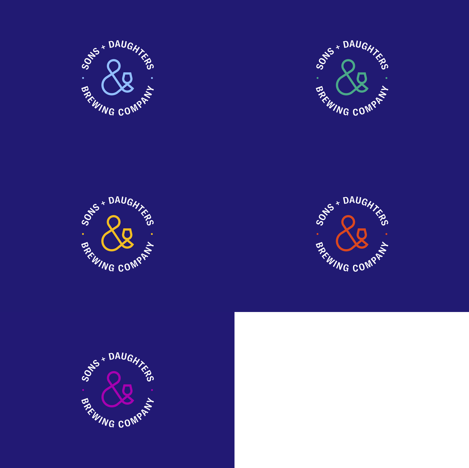
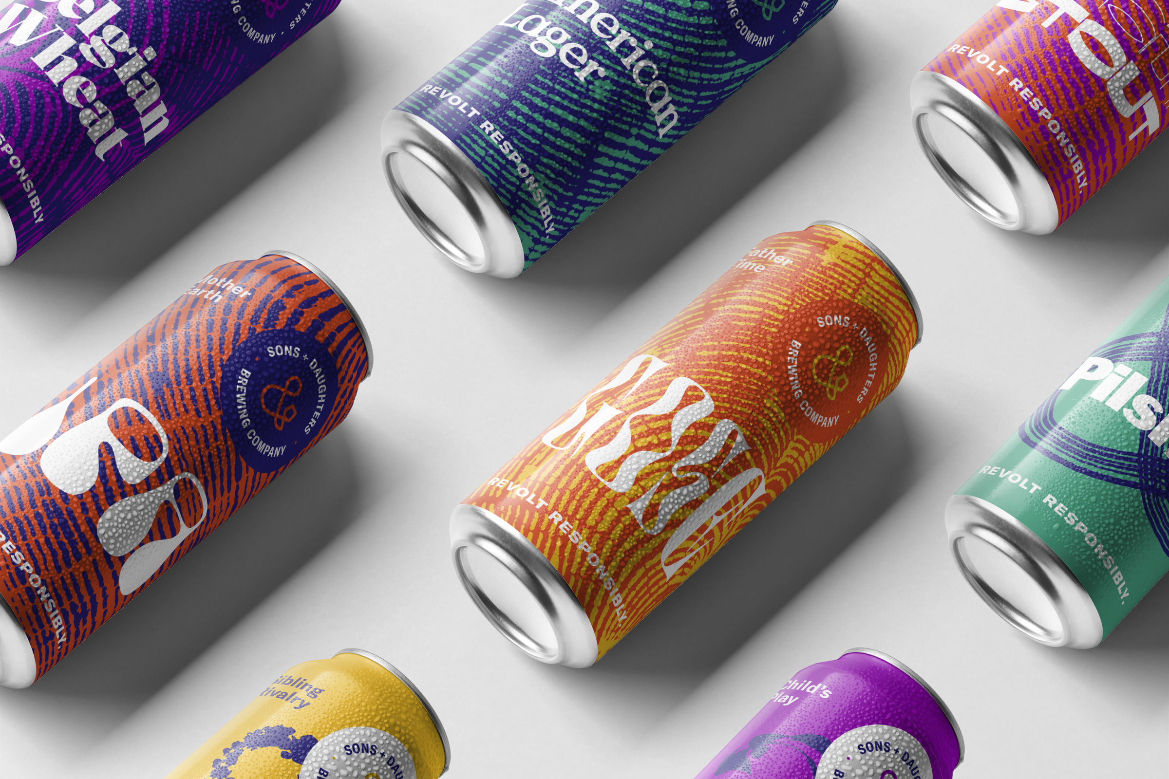
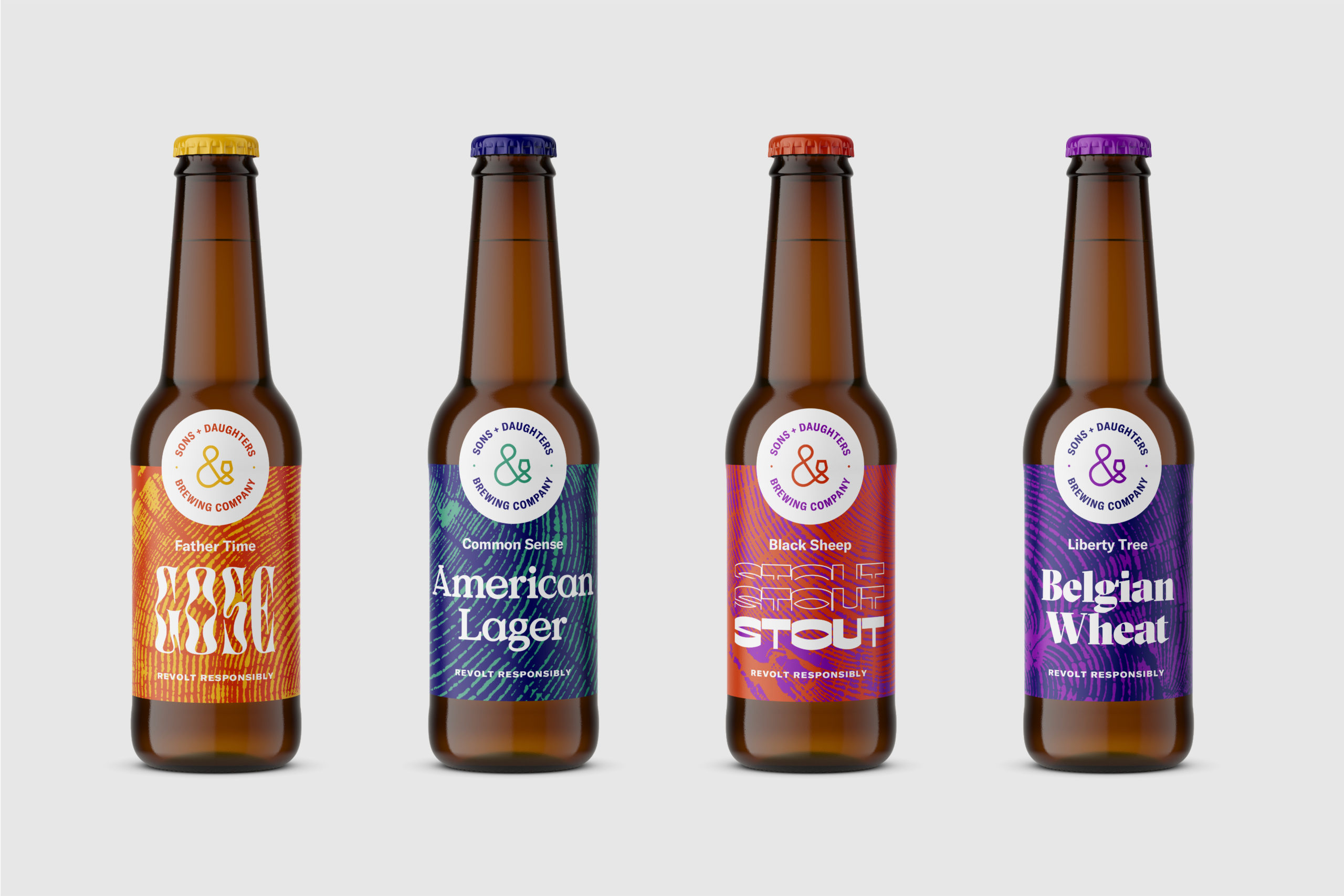
The brand elements include the color palette and typography, emphasizing the historical aspects of the brand’s identity. The blue signifies the importance of the seaboard and communications between the colonies leading up to the American Revolution. The spectrum of vibrant colors signifies the homespun cloth produced by the Daughters of Liberty for the colonists to wear instead of British textiles.
Grilli Type (GT) America Condensed, the identity font, unifies the best design features from both the 19th-century American Gothic tradition and the 20th-century Swiss Neo-Grotesque typefaces.


Packaging Concept
This packaging concept introduces tree ring imprints as a visual element to highlight the passage of time, the growth of families, and the broader historical context. A tree's rings are known to record its age and the changing climate conditions important to address in this generation. A family tree is the most common depiction of one's ancestors and provides a sense of one's roots.
However, the symbolism of the tree ring imprints goes even more profound in that the symbol of the Sons and Daughters of Liberty revolt was the stump of an ancient elm tree. As the seeds of revolution began to grow in Boston, increasingly larger crowds would gather under an old elm just outside of a sympathetic tavern to organize resistance to the British political oppression and increased military activity.
This elm tree was initially known as the "Tree of Liberty" by the freedom-seeking colonists. In a shocking act of retaliation, British loyalists and soldiers cut the tree down to a stump in 1775 yet the colonists defiantly continued to congregate by the stump and renamed the symbol of rebellion the "Liberty Stump."


Marketing Design
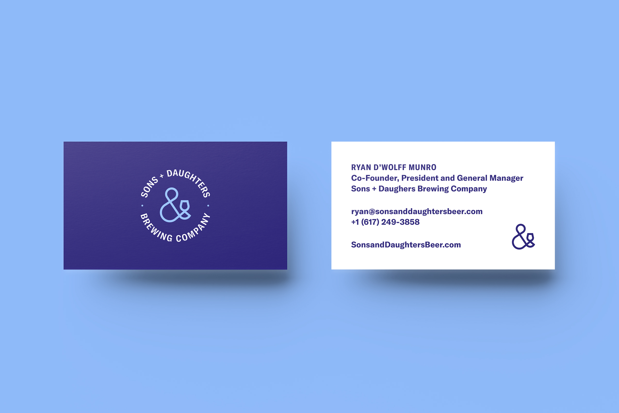
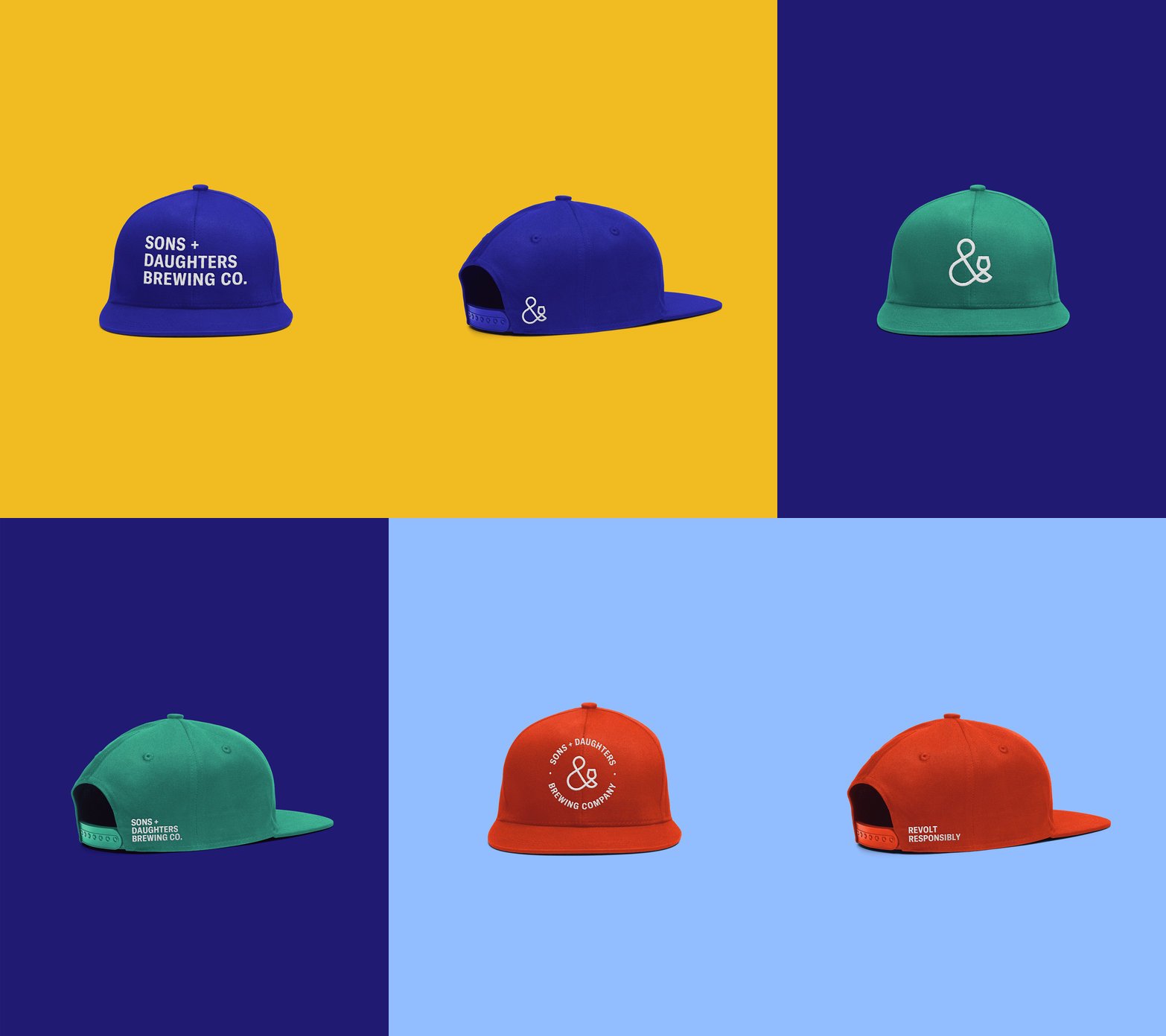
The identity is adaptable with each medium for marketing in print, merchandise, and the living environment. The exploration of color and versatility is valuable to the identity. The spectrum of colors creates a vibrant and living brand with the possibility to broaden the audience. The minimal symbol quickly identifies the services provided and that all are welcome to grab a drink.

Year
2019
Role
Creative Director
Organization
Sons + Daughters Brewing Co.
Sector
Food + Beverage
Selected Works
© 2025 Delane Meadows, LLC