Policy Topics
User Research
Web Design (UI)
User Experience (UX)
Harvard Kennedy School’s redesign of the Policy Topics section modernizes how the School shares ideas online. Consolidating 27 separate pages into one dynamic, topic‑driven hub, the team—led by the design lead in close partnership with communications, design, and operations—delivered an experience that emphasizes clarity, credibility, and accessibility, making expert content easier to find and the platform easier to keep current.
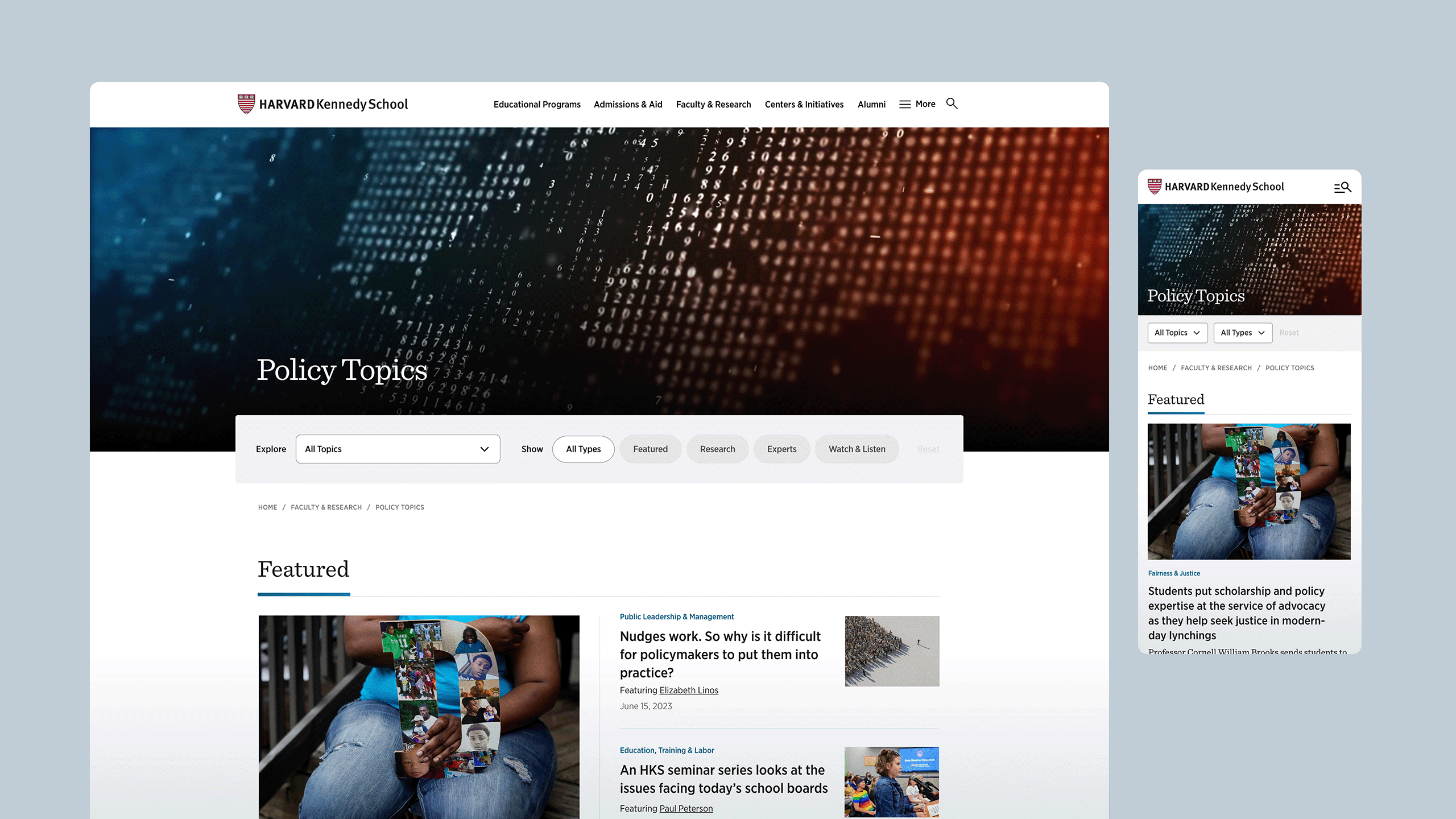
Context + Challenge
By 2020, the Policy Topics area reflected internal taxonomy more than user behavior—lots of pages, little momentum for visitors. The assessment recommended simplifying to broad, user‑oriented umbrellas, separating tagging from editorial messaging, and re‑casting Themes as feature‑style storytelling tied to timeliness rather than as static subpages. It also urged a ‘push’ strategy (newsletter, homepage) and a “front door” mindset so navigation and landing experiences do more of the work.
Stakeholder feedback later in 2020 echoed this: the landing page felt overwhelming, and layering “Priorities” added clicks without helping users. The directive: surface timely, relevant content first and reduce static lists.
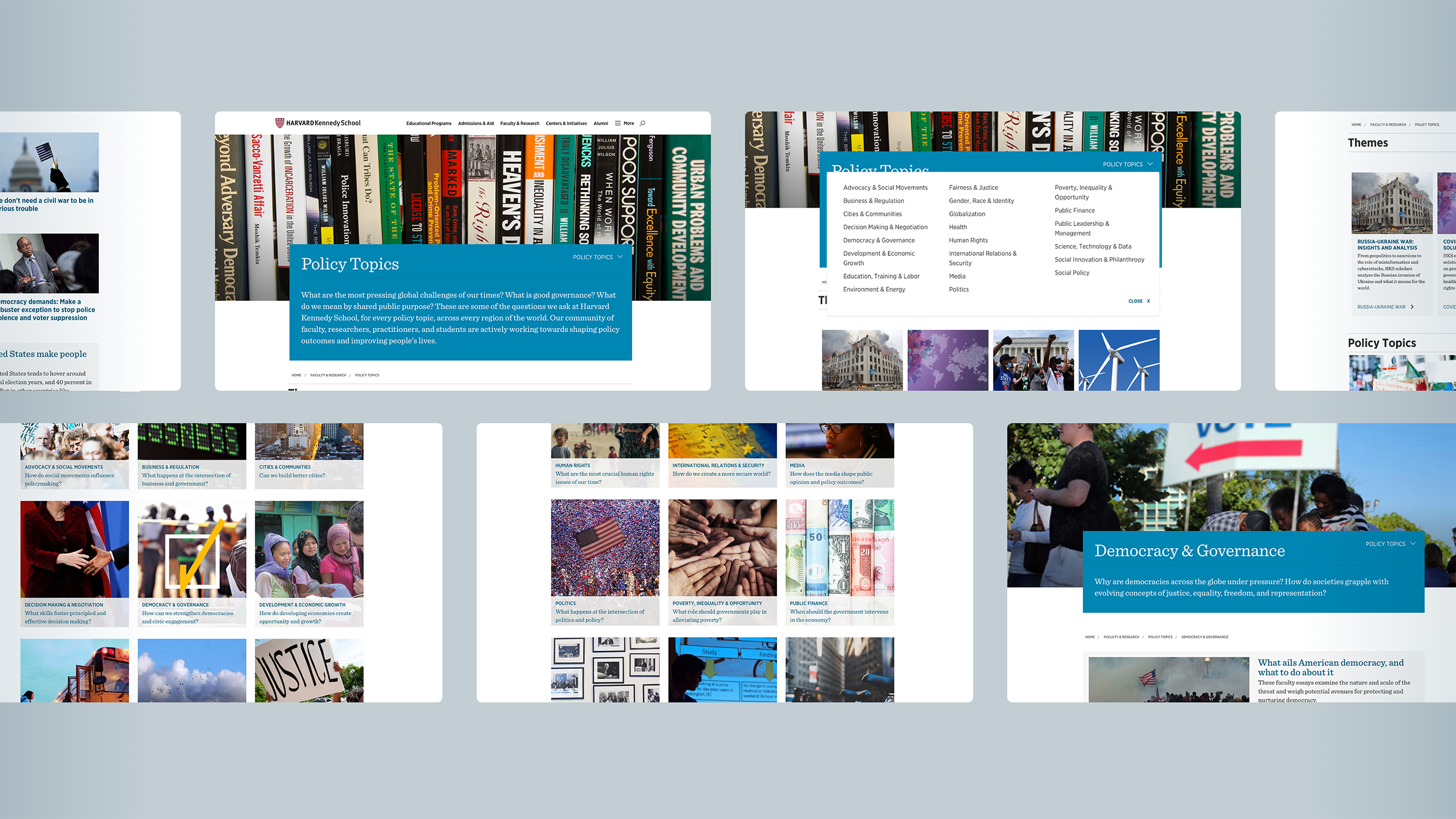
Screenshots of the previous Policy Topic landing page and topic webpages.
Strategy + Principles
When I joined as design lead in March 2022, we reset the project around two promises: Reduce decisions. Increase momentum.
Design principles:
- Fewer, clearer entry points (single hub, predictable zones).
- Recency and relevance over volume (automated surfacing via tags).
- Blend story + research (articles, research, faculty expertise together).
- Keep users in flow (filters that don’t trap; media plays in place).
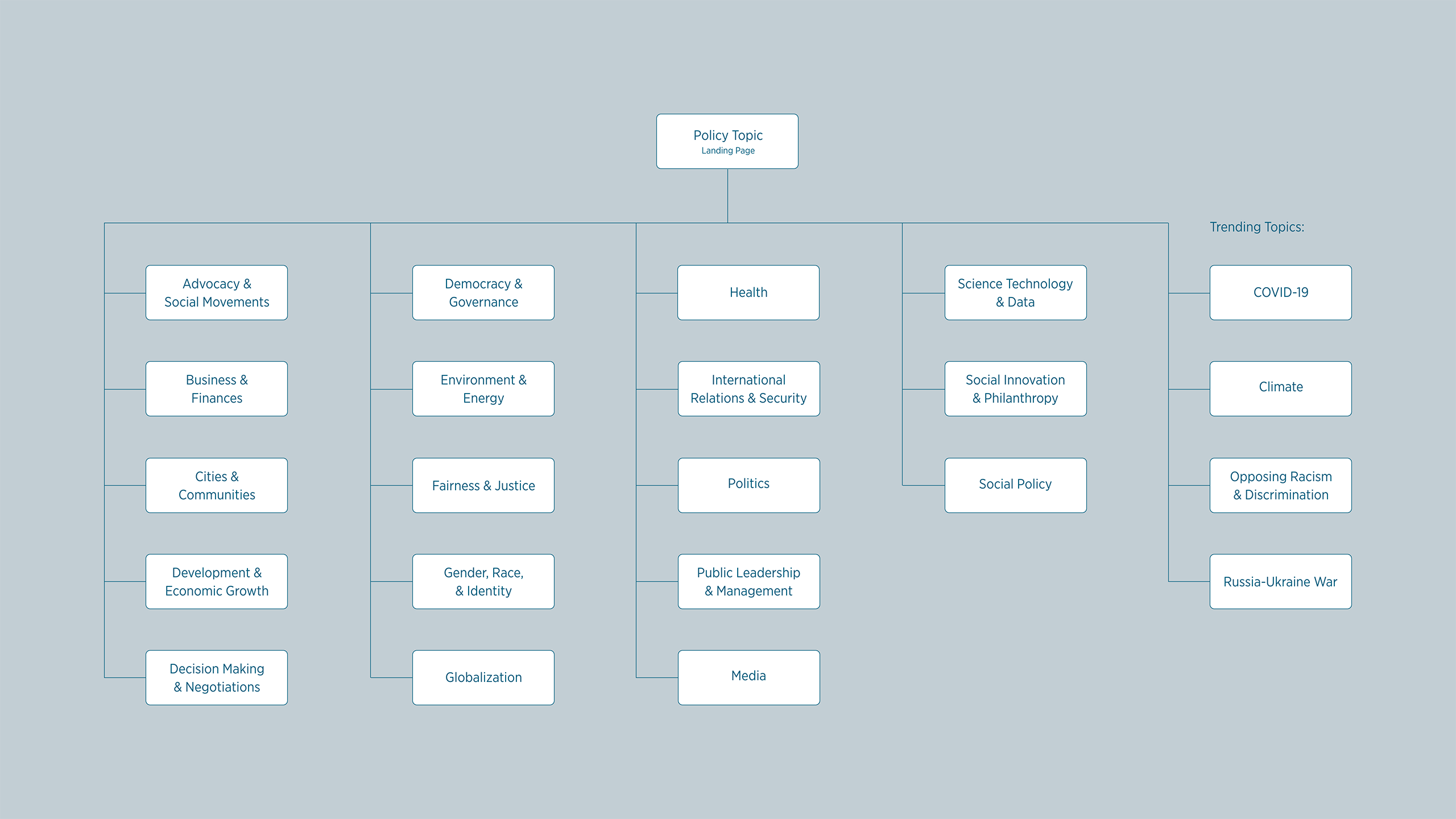
Information architecture: 1 landing page, 27 webpages
Wireframes
We translated the strategy into low-fidelity wireframes: modular cards, topic intros, and grouped content lanes (Features/Press · Watch & Listen · Research/Experts) to match how people actually browse, while setting up automation to keep the page fresh without a heavy manual lift.
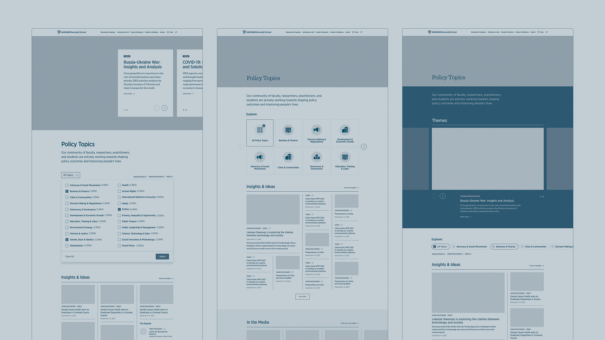
Low-fidelity wireframes with variations of the themes component and how the many topic selections are displayed.
Design Prototype
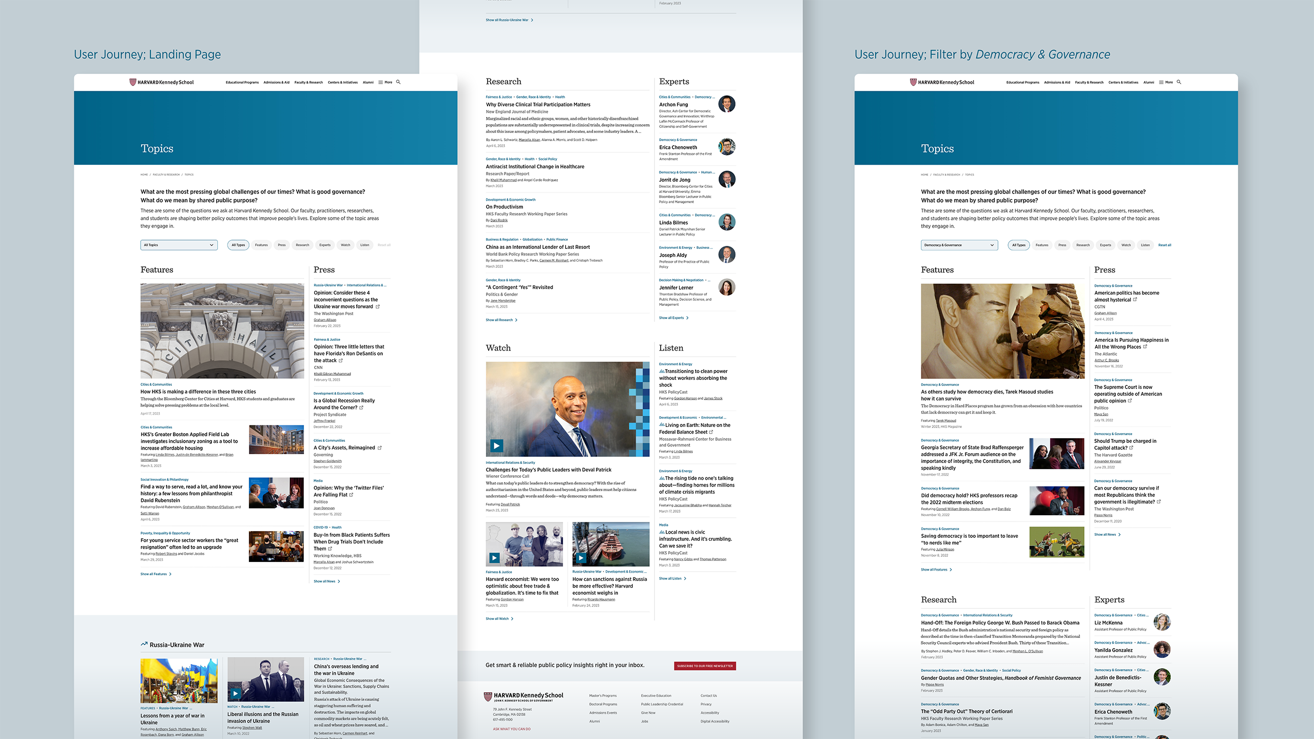
The design prototype operationalized the structure:
- Three grouped content zones for scanning rhythm,
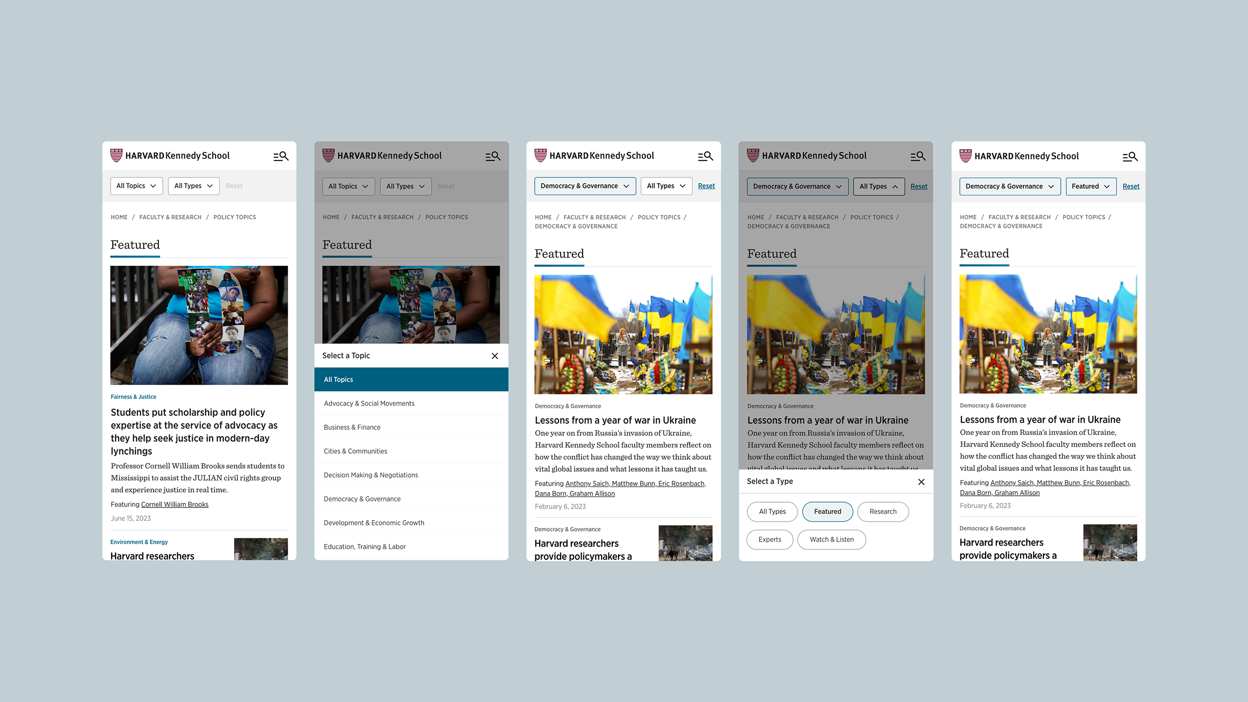
- Sticky toolbar (mobile) with button‑style filters and a "Clear" action,
- Nested themes under parent topics, plus Trending Topics to surface recency.
Decision summary: nest themes; keep content types as buttons (not dropdown); make the toolbar sticky (mobile); add "Clear"; hero image/video changes with topic selection.
Testing + Iteration
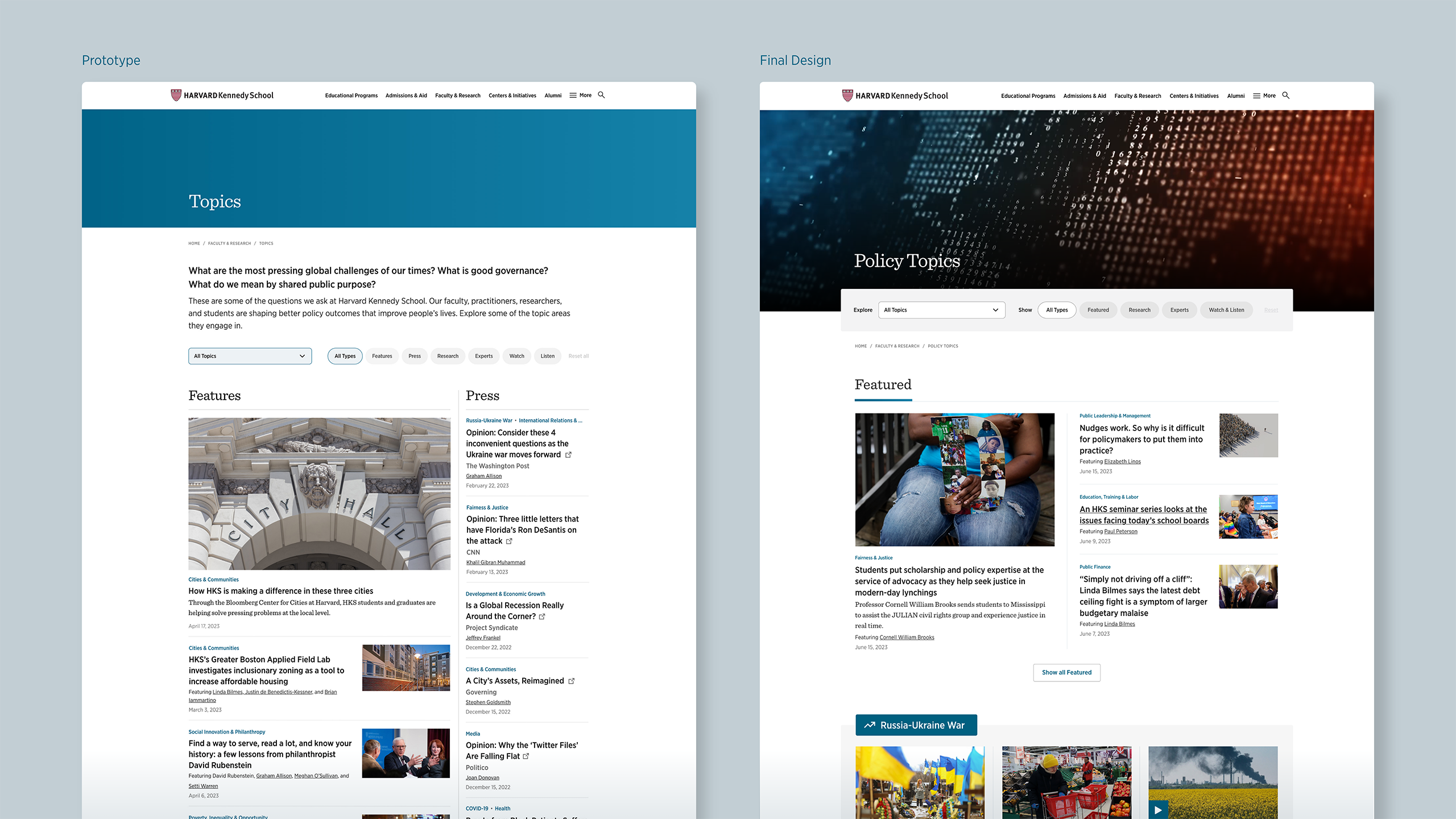
External testing confirmed the credibility and overall ease, prompting us to adjust density by decoupling content, removing external content (such as press, center, department, etc.), and adding visual distinction from generic news layouts. We increased white space, simplified labels, elevated Trending Topics, refined contrast/typography, and changed copy to make it clear that the newsletter is free.
Leadership Alignment
We presented the redesign to the school dean and executive leadership, and it received strong approval to move forward. The project history also captured our pivot to one dynamic page and clarified the newsletter CTA as free—a user confusion we’d seen in research.
“The new strategic approach and design are extraordinary.”
—Dean Elmendorf
Build + Launch
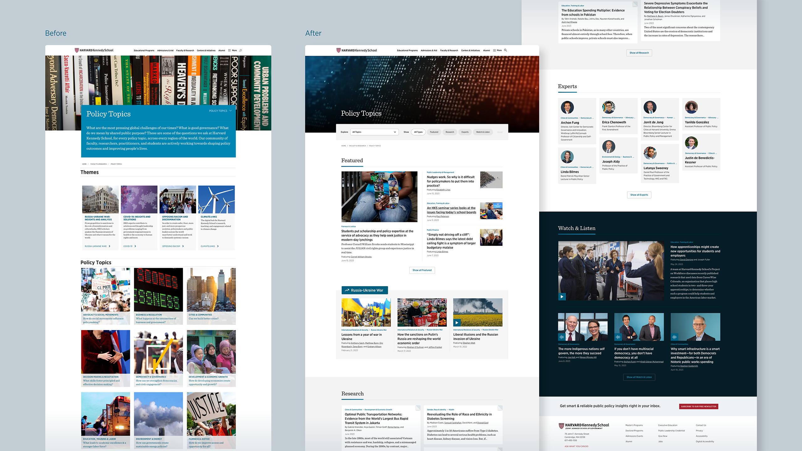
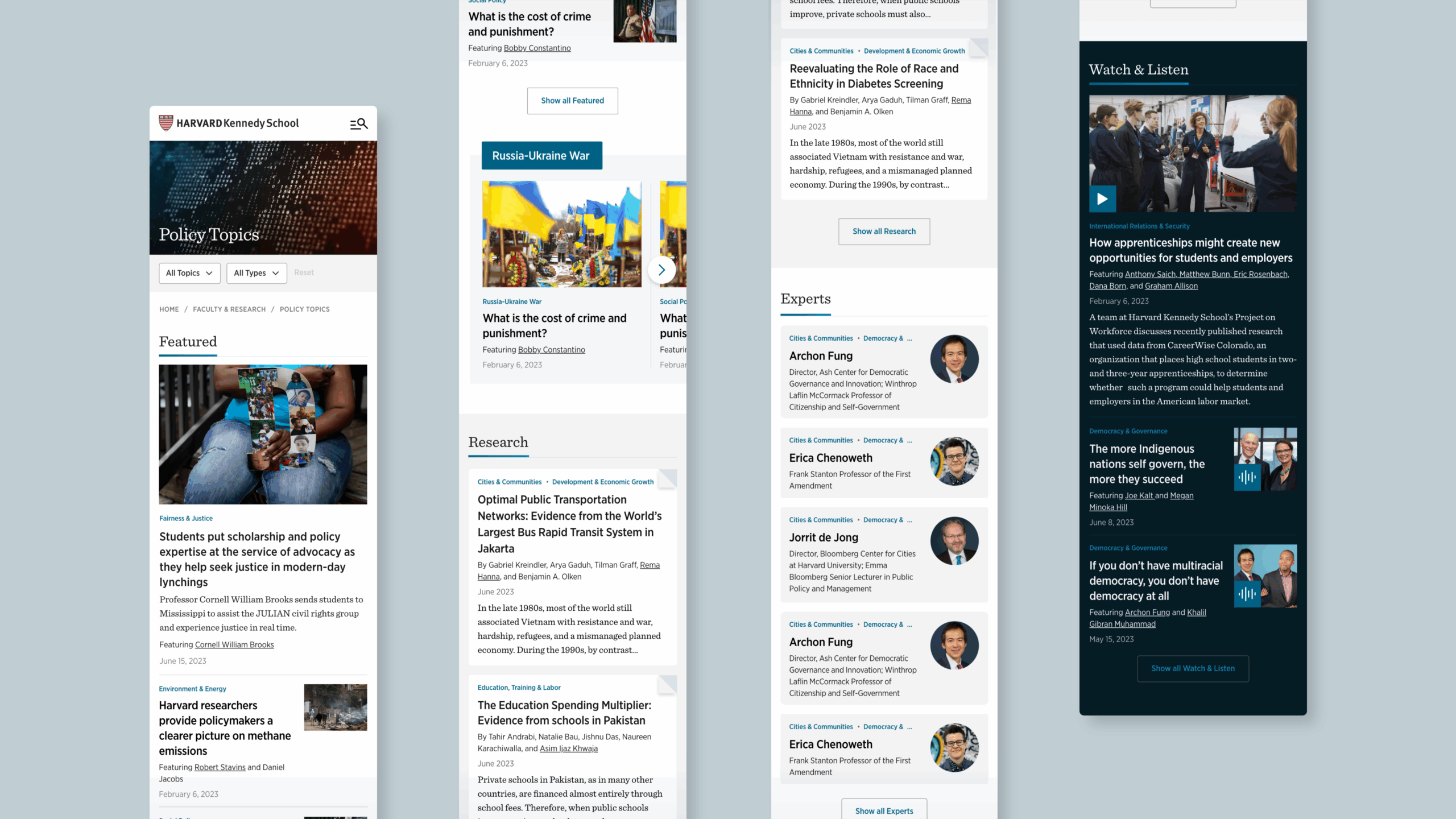
We handed off final desktop/mobile designs, specs, tokens, and a CMS tagging matrix to support automated surfacing. In December 2023, the new Policy Topics hub launched—27 pages → 1 dynamic, responsive page that leads with fresh, relevant content and positions HKS as a producer of ideas and insights.
Outcome + Validation
The redesign measurably improved session quality and depth, reduced bounce rates, performed strongly on mobile devices, and broadened the ways people arrive—validated by high SUS scores and clearer value comprehension.
- Usability (post-launch testing): 92.5% SUS (up from 73% in 2022 and 70% in 2023); 86% said content felt credible/current; 71% clearly understood newsletter value (vs 57% in 2022, 21% in 2023).
- Engagement quality: Avg. visit duration rose 5:52 → 7:21 → 7:26; bounce fell 38% → 16% → 12% (2023 → 2024 → 2025 YTD).
- Deeper sessions: Views/session increased 0.76 → 1.23 → 1.15, sustaining a clear step-up vs. pre-redesign.
- Volume & reach: Views grew 16,173 → 18,400 YoY post-launch; 10,964 in 2025 YTD (Jan–Oct).
- Mobile-first: Mobile share held ~75–77% post-launch.
- Acquisition mix: Organic remained #1 in 2024; 2025 YTD shows more Direct, Email/newsletters, and AI Services (including chatgpt.com).
Year
2022-2023
Role
Senior Designer (Design Lead)
Organization
Harvard Kennedy School (HKS),
Office of Communication and Public Affairs (OCPA)
Team
Maya Horowitz, Web Strategy & Operations Manager; Janet Friskey, Director of Design; Nora Delaney, Senior Director of Communications; Sofia Cabalquinto, Chief Communication Officer
Partners
Interactive Strategies, Development; WEVO (2022/2023), UserFeel (2024), User Research
Selected Works
© 2025 Delane Meadows, LLC